They say, never judge a book by its cover…
But that seems to apply to everything but books. People certainly judge a book by its cover. All aspects of the design. Color, image, font, word placement, and the list goes on. It can be daunting and frustrating. Should you do the cover yourself? Do you hire a designer? Do you hire a company? If you hire someone else, what do you look for when making your decision?
So many questions. Questions that I cannot answer with my limited experience. So, I decided to ask an expert to cohost a blog with me. Thankfully, he said yes.
Who is our mystery guest?
I am super excited to introduce Ron Miller!
Ron is an illustrator-author specializing in science (especially astronomy), science fiction, and fantasy. He is the author of more than 70 books, many of them award-winning (including the Hugo Award, I added that because he is too humble to do it himself). He provides illustrations for many traditional publishers and magazines and has designed 400+ book covers. He has also created postage stamps and worked as an illustrator and designer for films such as “Dune.” To learn more about Ron, check out his website here.
Here we go!
Thanks for joining me, Ron. I appreciate you taking the time to share your thoughts and expertise on book cover design. Let’s get right into it. Why do you think people are so enamored with book covers?
Ron: I think the only people who are really “enamored” by book covers are the authors themselves. It’s understandably pretty difficult to not take the cover of one’s book personally.
If you must do an elevator pitch cover design for a new author, how would that go?
Ron: It’s not really done exactly that way, regardless of the author’s experience. Even a cover for an established author goes through much the same process as that for a new name. After getting some idea of what the book is about, its characters and any set pieces—scenes that might best represent the nature of the book visually—I will prepare three different sketches. The author or art director will choose one and let me know what changes or revisions they’d like to see. Then the final art is created. Here is an example.

Talk to me about fonts. When I see you commenting on book covers, it always seems to include a comment on fonts. What do you think is the biggest mistake people make with fonts?
Ron: Trying to be too elaborate. This is especially the case with fantasy and romance novels, where the urge to include every available swirl and swash is given full sway. There is also the urge to apply all sorts of special effects to type: embossing, textures, sparkly highlights, etc. These effects often only serve to obscure the type and when they are applied to already decorative typefaces the results can be devastating. When Mies van der Rohe said that “less is more” he may have been talking about book cover typography instead of architecture.
The first thing that the title of a book needs to do is be readable…and it has to be readable at first glance and at every size. If no one can read, the title of your book, you have lost a lot of advantages. A book cover is not a puzzle for the potential reader to figure out.
Speaking of discussions in writing groups. One thing you said stuck with me. What does your book look like in a thumbnail? Can you explain why that is so important?
Ron: A thumbnail image is how most people will probably first see your book, either on an Amazon or Barnes & Nobel page, in a catalog, or as part of a review. This means that your cover needs to be readable at any size. And this includes the possibility that the cover may even be first seen in black and white. If your cover is dark with type that doesn’t contrast well with the background, all you will end up with is a murky little postage stamp that not only doesn’t attract the eye of the potential reader, it says nothing at all about your book.
There are two good tests for any book cover. The first is to reduce it to the same size as an Amazon thumbnail image. The second is to convert the cover to grayscale. This latter is a test for contrast: everything should still pop out even when the cover is in B&W.
Do you have any favorite covers? Your own or another artist? I have to admit, one of mine is Space Viking by H. Beam Piper.
Ron: I have far too many favorite covers to list here! Many of my illustrator colleagues have done or do book covers and all of them are outstanding. One of my favorite artists is my late friend, Steve Hickman (who sadly passed away last Summer). He created hundreds of science fiction and fantasy covers, often designing the type into the painting itself. You can see his work here http://www.stephenhickman.com/

Steve Hickman Covers
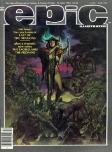
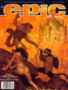


My blog contains a great many examples of what I think are outstanding book covers. A half dozen entries are devoted to some of the best examples from the history of book cover design, going back to the 19th century. Other posts are devoted to outstanding examples of recent covers from different publishers and different designers. This is the most recent post along those lines https://at.tumblr.com/bookcoverbasics/covers-for-horror-and-mystery-novels-from-small/sa45rb5uki6s
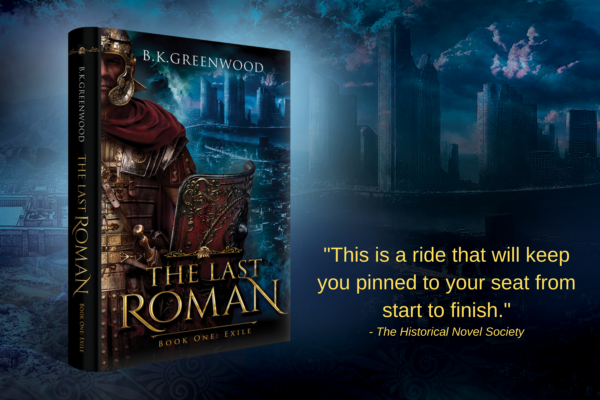
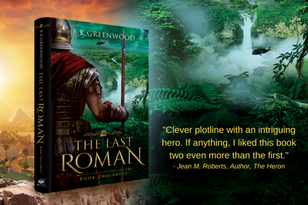
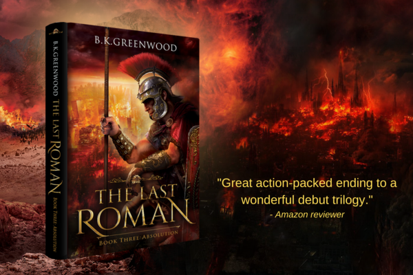
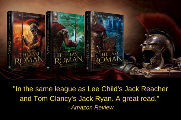
It’s probably easier to pick some of my favorites from among covers I have done! (B.K.: I went ahead and did that, including them here).

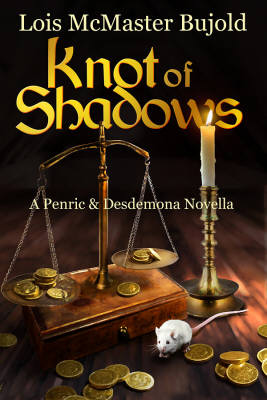

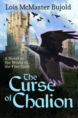
Can you talk about covers and series? How important is it to have a consistent theme, and does that require you to have all of them designed at once?
Ron: Well, branding is indeed important when a series is involved: you want to have that visual continuity. I have often compared a book cover to packaging (which is what they are), no different than the label on a can of peas at the grocery store. There is a reason why products from different manufacturers have consistent labeling—even if that is only a logo. A customer loyal to, say Del Monte canned vegetables will look for the Del Monte label. Likewise, a reader caught up in a series will look for a cover on a new book that lets them know it is part of the series. This can be done in any number of ways, though. There can be a kind of logo, a consistent style of typography, a similarity in the style of art or any combination of these things.
What advice would you give to someone who says they do not have $50 or $100 to hire a professional cover designer?
Ron: Well, I would advise them to save up their money and not try to take things into their own hands. This is especially so if the author has no experience or ability in illustration or graphic design. Even if they do, it’s very, very hard for an author to look at their own cover objectively, as a prospective reader would. It’s too easy to get wrapped up in details that seem immensely important to you—making sure that a character has the right number of buttons on their uniform—or including things that seem significant to you but are only meaningful to someone who has already read the book, which is putting the cart before the horse.
One of my favorite examples of the lack of objectivity and of being too close to the subject is the time I was shown a cover depicting a rustic stone bridge crossing a lovely little stream in the middle of a sunny meadow. It would have been perfect for a travel guide to the English countryside, but I was told that the book was a rousing high fantasy adventure in the line of Tolkien or Howard. “How,” I asked, “does this have anything to do with high fantasy?”
“Well,” the author replied, “my main character is a troll and that’s the bridge he lives under.”
Think of it this way: every single one of the thousands of covers at lousybookcovers.com were thought to be perfect by the author.
Ah, you bring me to my last question. You have posted about a website that tracks terrible cover designs. Can you share that link? And, I hate to put you on the spot, but can you show us the top three worst covers you have ever seen?
Ron: Here is the link:
That request is a tall order! I see horrific covers almost every day! Let me see what I can do…
Sign up for future blog updates!
Get book updates

171 Comments on “Eek, my book cover design sucks!”
Thank you very much for sharing, I learned a lot from your article. Very cool. Thanks. nimabi
Thank you for your sharing. I am worried that I lack creative ideas. It is your article that makes me full of hope. Thank you. But, I have a question, can you help me?
Magnificent site. Plenty of useful information here. I am sending it to some pals ans additionally sharing in delicious. And certainly, thank you to your effort!
It is very comforting to see that others are suffering from the same problem as you, wow!
Can you be more specific about the content of your article? After reading it, I still have some doubts. Hope you can help me.
Can you be more specific about the content of your article? After reading it, I still have some doubts. Hope you can help me.
Thank you for your sharing. I am worried that I lack creative ideas. It is your article that makes me full of hope. Thank you. But, I have a question, can you help me?
Thank you so much!
Thanks for thr great article!
It is very comforting to see that others are suffering from the same problem as you, wow!
The point of view of your article has taught me a lot, and I already know how to improve the paper on gate.oi, thank you.
Can you be more specific about the content of your article? After reading it, I still have some doubts. Hope you can help me.
Thanks for sharing. I read many of your blog posts, cool, your blog is very good.
Thanks for thr great article!
Thanks for thr great article!
I don’t think the title of your article matches the content lol. Just kidding, mainly because I had some doubts after reading the article.
Great post! I learned something new and interesting, which I also happen to cover on my blog. It would be great to get some feedback from those who share the same interest about Counterfeit Money for Sale, here is my website Webemail24 Thank you!
Nice post! You have written useful and practical information. Take a look at my web blog Seoranko I’m sure you’ll find supplementry information about Escort Services you can gain new insights from.
Thank you so much!
It is very comforting to see that others are suffering from the same problem as you, wow!
Thank you very much for sharing, I learned a lot from your article. Very cool. Thanks.
helloI really like your writing so a lot share we keep up a correspondence extra approximately your post on AOL I need an expert in this house to unravel my problem May be that is you Taking a look ahead to see you
Your posts stand out from other sites I’ve read stuff from. Keep doing what you’re doing! Here, take a look at mine Article World for content about about SEO.
Hi there, I found your web site via Google while searching for a related topic, your web site came up, it looks good. I have bookmarked it in my google bookmarks.
I don’t think the title of your article matches the content lol. Just kidding, mainly because I had some doubts after reading the article.
Sweet blog! I found it while surfing around on Yahoo News. Do you have any suggestions on how to get listed in Yahoo News? I’ve been trying for a while but I never seem to get there! Appreciate it
I like this post, enjoyed this one regards for putting up. “‘I have done my best.’ That is about all the philosophy of living one needs.” by Lin Yutang.
It’s best to take part in a contest for top-of-the-line blogs on the web. I will advocate this web site!
Bookmarked, so I can continuously check on new posts! If you need some details about Thai-Massage, you might want to take a look at FQ5 Keep on posting!
Can you be more specific about the content of your article? After reading it, I still have some doubts. Hope you can help me. https://www.binance.com/pt-PT/join?ref=DB40ITMB
Greetings from Carolina! I’m bored to tears at work so I decided to browse your blog on my iphone during lunch break. I enjoy the knowledge you present here and can’t wait to take a look when I get home. I’m surprised at how fast your blog loaded on my cell phone .. I’m not even using WIFI, just 3G .. Anyways, superb blog!
Hi, I think your site might be having browser compatibility issues. When I look at your website in Safari, it looks fine but when opening in Internet Explorer, it has some overlapping. I just wanted to give you a quick heads up! Other then that, fantastic blog!
The way you put together the information on your posts is commendable. I would highly recommend this site. You might also want to check my page YH6 for some noteworthy inputs about Airport Transfer.
A person essentially lend a hand to make severely posts I would state. This is the first time I frequented your website page and thus far? I surprised with the research you made to make this particular publish extraordinary. Magnificent job!
The phrase never judge a book by its cover emphasizes looking beyond appearances. This is especially true in fashion; a the red one clothing can symbolize confidence and individuality. While its vibrant look captures attention, the deeper personal stories behind such choices reveal true character and self-expression.
I’ve been really impressed with CBD gummies and like https://www.cornbreadhemp.com/pages/how-long-do-thc-gummies-take-to-work . They’re not only delicious but also incredibly available as a replacement for getting a commonplace dosage of CBD. I friendship how cautious they are, making them perfect towards when I’m on the go. I’ve personally noticed they assistants me rest and snooze superior, extraordinarily after a stressful day. The unchanging dosage in each gummy also takes the guesswork out of managing how much CBD I’m consuming. If you’re point of view of maddening CBD, gummies are a consequential opportunity—just be sure to buy off from a trusted name brand in requital for the subdue results!
Redemption often involves transformation and new beginnings, much like the resurgence of men’s leather jackets in fashion. These jackets symbolize a fresh start, allowing individuals to express their identity and confidence. Just as characters seek redemption, fashion can empower us to redefine ourselves and embrace new chapters in life
Design is essential in creating impactful visuals, and graphic overlay design exemplifies this principle. A well-executed graphic overlay can enhance user experience by providing clear, engaging information. Whether for apps or displays, thoughtful design ensures that graphics not only attract attention but also effectively communicate the intended message, enhancing overall functionality.
“They say, never judge a book by its cover, but sometimes, the cover tells a story of its own. Take hugh hefner outfit, for example. His signature look—smoking jacket and slippers—was more than just fashion; it was a statement of confidence, style, and unapologetic individuality, challenging perceptions.”
The saying “never judge a book by its cover” is a powerful reminder to look beyond the surface and consider the deeper qualities of something or someone. Similarly, when it comes to elux juice, it’s not just about the packaging but the experience it offers. The quality of elux juice comes from its flavors and smoothness, which can only be appreciated when you take the time to explore and try it, rather than making assumptions based on appearances. It’s a great example of how sometimes the best things are hidden behind a simple exterior.
Jackets are essential wardrobe staples, offering both style and functionality. The yellowstone rip jacket worn by Rip Wheeler in the popular TV series Yellowstone, stands out for its rugged, western appeal. It combines durability with a classic design, making it an ideal choice for fans and fashion-forward individuals alike.
Jackets are essential wardrobe staples, offering both style and functionality. The yellowstone rip jacket worn by Rip Wheeler in the popular TV series Yellowstone, stands out for its rugged, western appeal. It combines durability with a classic design, making it an ideal choice for fans and fashion-forward individuals like
Your point of view caught my eye and was very interesting. Thanks. I have a question for you.
Have you ever considered creating an e-book or guest authoring on other sites? I have a blog based upon on the same information you discuss and would love to have you share some stories/information. I know my readers would enjoy your work. If you are even remotely interested, feel free to shoot me an email.
I don’t think the title of your article matches the content lol. Just kidding, mainly because I had some doubts after reading the article.
Your point of view caught my eye and was very interesting. Thanks. I have a question for you.
Your article helped me a lot, is there any more related content? Thanks!
Thanks for sharing. I read many of your blog posts, cool, your blog is very good.
Thank you for your sharing. I am worried that I lack creative ideas. It is your article that makes me full of hope. Thank you. But, I have a question, can you help me?
Thank you for your sharing. I am worried that I lack creative ideas. It is your article that makes me full of hope. Thank you. But, I have a question, can you help me?
Your article helped me a lot, is there any more related content? Thanks!
Your point of view caught my eye and was very interesting. Thanks. I have a question for you.
Thanks for sharing. I read many of your blog posts, cool, your blog is very good.
Can you be more specific about the content of your article? After reading it, I still have some doubts. Hope you can help me.
Thank you for your sharing. I am worried that I lack creative ideas. It is your article that makes me full of hope. Thank you. But, I have a question, can you help me?
Thanks for sharing. I read many of your blog posts, cool, your blog is very good.
Can you be more specific about the content of your article? After reading it, I still have some doubts. Hope you can help me.
Can you be more specific about the content of your article? After reading it, I still have some doubts. Hope you can help me. https://www.binance.com/da-DK/register?ref=V2H9AFPY
Can you be more specific about the content of your article? After reading it, I still have some doubts. Hope you can help me. https://accounts.binance.info/register?ref=P9L9FQKY
I have learn some excellent stuff here. Definitely worth bookmarking for revisiting. I surprise how much attempt you place to create the sort of magnificent informative site.
I don’t think the title of your article matches the content lol. Just kidding, mainly because I had some doubts after reading the article.
) Jeg vil besøge igen, da jeg har bogmærket det. Penge og frihed er den bedste måde at ændre sig på, må du være rig og
Can you be more specific about the content of your article? After reading it, I still have some doubts. Hope you can help me.
Introducing to you the most prestigious online entertainment address today. Visit now to experience now!
Díky moc!|Hej, jeg synes, dette er en fremragende blog. Jeg snublede over det;
I don’t think the title of your article matches the content lol. Just kidding, mainly because I had some doubts after reading the article.
This is my first time go to see at here and iam actually pleassant to read everthing at one place.
I went over this internet site and I believe you have a lot of fantastic info , saved to favorites (:.
Your article helped me a lot, is there any more related content? Thanks!
Thank you for your sharing. I am worried that I lack creative ideas. It is your article that makes me full of hope. Thank you. But, I have a question, can you help me?
Can you be more specific about the content of your article? After reading it, I still have some doubts. Hope you can help me.
Hello there! I just would like to give you a big thumbs up for your excellent info you’ve got right here on this post. I am returning to your website for more soon.
Thanks-a-mundo for the blog article.Really thank you! Much obliged.
Hi, Neat post. There is a problem with your site in internet explorer, would check this… IE still is the market leader and a good portion of people will miss your fantastic writing because of this problem.
Thanks for sharing. I read many of your blog posts, cool, your blog is very good.
What’s up, I check your new stuff regularly. Yourstory-telling style is awesome, keep up the good work!
mükemmel bir site
555
I’ve been following this blog for years and it’s amazing to see how much it has grown and evolved Congratulations on all your success!
Mitolyn is a cutting-edge natural dietary supplement designed to support effective weight loss and improve overall wellness.
“. WebNewtype (2021年4月15日). 2021年4月24日閲覧。 4月 – 株式会社リクルートゼクシィナビ、株式会社リクルートスタッフィングクラフツを設立。管理すべきとする超人登録法が成立し、ヒーロー同士が登録法の是非を巡って争うがミュータント登録法などを経験したX-MENは争いに与せず事態を静観していた(『シビル・
Thank you for your sharing. I am worried that I lack creative ideas. It is your article that makes me full of hope. Thank you. But, I have a question, can you help me?
“Hi there, I enjoy reading all of your article.
I like to write a little comment to support you.” jasa pbn
I don’t think the title of your article matches the content lol. Just kidding, mainly because I had some doubts after reading the article.
You know your projects stand out of the herd. There is something special about them. It seems to me all of them are really brilliant! 카지노사이트
The article posted was very informative and useful. You people are doing a great job. Keep going 먹튀 검증
It was thinking about whether I could utilize this review on my other site, I will connect it back to your site though.Great Thanks. オンカジ入金不要ボーナス
The article posted was very informative and useful. You people are doing a great job. Keep going 먹튀 검증
Pretty good post. I just stumbled upon your blog and wanted to say that I have really enjoyed reading your blog posts. Any way I’ll be subscribing to your feed and I hope you post again soon. Big thanks for the useful info. 해외야구중계
Trying to say thank you won’t simply be adequate, for the astonishing lucidity in your article. I will legitimately get your RSS to remain educated regarding any updates. Wonderful work and much accomplishment in your business endeavors 카지노사이트
Stunning! Such an astonishing and accommodating post this is. I super love it. It’s so great thus amazing. I am simply stunned. I trust that you keep on doing your work like this later on moreover 스포츠중계
Great post i must say and thanks for the information. Education is definitely a sticky subject. However, is still among the leading topics of our time. I appreciate your post and look forward to more. 먹튀없는사이트
Trying to say thank you won’t simply be adequate, for the astonishing lucidity in your article. I will legitimately get your RSS to remain educated regarding any updates. Wonderful work and much accomplishment in your business endeavors 유튜벳
I appreciate several from the Information which has been composed, and especially the remarks posted I will visit once more. 링크모음사이트 링크팡
I am propelled by the information that you have on this blog. It demonstrates how well you grasp this subject 해외선물솔루션
Very good points you wrote here..Great stuff…I think you’ve made some truly interesting points.Keep up the good work 먹튀검증
Great post i must say and thanks for the information. Education is definitely a sticky subject. However, is still among the leading topics of our time. I appreciate your post and look forward to more. 슬롯커뮤니티
Trying to say thank you won’t simply be adequate, for the astonishing lucidity in your article. I will legitimately get your RSS to remain educated regarding any updates. Wonderful work and much accomplishment in your business endeavors 유튜벳
This Post is providing valuable and unique information; I know that you take a time and effort to make a awesome article 레플리카사이트
I genuinely like you’re making style, inconceivable information, thankyou for posting 카지노 커뮤니티
Thank you so much for sharing this Informative article with us. I really love the way of your presentation. Please keep sharing more 크레이지슬롯
This is also a very good post which I really enjoy reading. It is not everyday that I have the possibility to see something like this 토토사이트
Trying to say thank you won’t simply be adequate, for the astonishing lucidity in your article. I will legitimately get your RSS to remain educated regarding any updates. Wonderful work and much accomplishment in your business endeavors 토토사이트
To start with You got an awesome blog .I will be keen on more comparative points. I see you got extremely exceptionally valuable themes, I will be continually checking your blog much appreciated antminer s21
I would like to thank you for the efforts you have made in writing this article. I am hoping the same best work from you in the future as well. In fact your creative writing abilities has inspired me to start my own Blog Engine blog now. Really the blogging is spreading its wings rapidly. Your write up is a fine example of it 크레이지알파
This is very interesting, You are a very skilled blogger. I’ve joined your rss feed and look forward to seeking more of your magnificent post. Also, I have shared your website in my social networks! 야구중계
You re in purpose of actuality a without flaw website admin. The site stacking speed is astonishing. It sort of feels that you’re doing any unmistakable trap. Besides, The substance are perfect work of art. you have completed a fabulous movement regarding this matter 검증사이트
This is also a very good post which I really enjoy reading. It is not everyday that I have the possibility to see something like this 크레이지슬롯
This is a fabulous post I seen by virtue of offer it. It is genuinely what I expected to see look for in future you will continue subsequent to sharing such an extraordinary post 실시간 카지노사이트
To start with You got an awesome blog .I will be keen on more comparative points. I see you got extremely exceptionally valuable themes, I will be continually checking your blog much appreciated antminer s21
I need to to thank you for this very good read!! I definitely loved every little bit of it. I have you bookmarked to check out new things you post 카지노사이트
I am overwhelmed by your post with such a nice topic. Usually I visit your blogs and get updated through the information you include but today’s blog would be the most appreciable. Well done 슬롯 사이트
“What a information of un-ambiguity aand preserveness of precious familiarity about
unpredicted feelings.” 토토사이트
This is a fabulous post I seen by virtue of offer it. It is genuinely what I expected to see look for in future you will continue subsequent to sharing such an extraordinary post 바카라사이트
very good fashion blog pedrovazpaulo entrepreneur
The article posted was very informative and useful. You people are doing a great job. Keep going 베팅의민족
“interesting blog thanks to this type fashion blog
” 메이저사이트
Thank you for your sharing. I am worried that I lack creative ideas. It is your article that makes me full of hope. Thank you. But, I have a question, can you help me?
The professional help with Medicaid documentation from these attorneys streamlined our application.
Do you have a spam issue on this blog; I also am a blogger, and I was wondering your situation; we havedeveloped some nice practices and we are looking to exchange strategies with other folks, why notshoot me an email if interested.
вывод из запоя в стационаре вывод из запоя в стационаре .
Thanks for sharing. I read many of your blog posts, cool, your blog is very good.
One company may offer the same coverage of the other but cost higher than the other.
Thanks for sharing. I read many of your blog posts, cool, your blog is very good.
Your article helped me a lot, is there any more related content? Thanks!
Thanks for sharing. I read many of your blog posts, cool, your blog is very good.
Hello just wanted to give you a quick heads up. The words in your content seem to be running off the screen in Safari. I’m not sure if this is a format issue or something to do with web browser compatibility but I figured I’d post to let you know. The layout look great though! Hope you get the issue solved soon. Many thanks
Hey there would you mind letting me know which web host you’re utilizing? I’ve loaded your blog in 3 completely different internet browsers and I must say this blog loads a lot faster then most. Can you recommend a good web hosting provider at a fair price? Kudos, I appreciate it!
Thank you for your sharing. I am worried that I lack creative ideas. It is your article that makes me full of hope. Thank you. But, I have a question, can you help me?
Thank you for your sharing. I am worried that I lack creative ideas. It is your article that makes me full of hope. Thank you. But, I have a question, can you help me?
Thanks for sharing. I read many of your blog posts, cool, your blog is very good.
Thanks for sharing. I read many of your blog posts, cool, your blog is very good.
Can you be more specific about the content of your article? After reading it, I still have some doubts. Hope you can help me.
Deneme bonusu veren siteler ile 2025 yılında en kaliteli siteleri bulun
I don’t think the title of your article matches the content lol. Just kidding, mainly because I had some doubts after reading the article.
Thanks for sharing. I read many of your blog posts, cool, your blog is very good.
I’ve been exploring for a little for any high quality articles or blog posts on this kind of area . Exploring in Yahoo I at last stumbled upon this web site. Reading this information So i’m happy to convey that I have a very good uncanny feeling I discovered just what I needed. I most certainly will make certain to don’t forget this web site and give it a look regularly.
Your article helped me a lot, is there any more related content? Thanks!
We’re a group of volunteers and starting a new schemein our community. Your website offered us with valuable information to work on. You have done a formidable joband our entire community will be thankful to you.
Your point of view caught my eye and was very interesting. Thanks. I have a question for you.
Bahis Siteleri 2025 listesiyle, 250 güvenilir bahis sitesinden deneme bonusu kazanın ve hemen kazanmaya başlayın
Amazon has taken several steps to promote this strategy.
hitclub game bài đổi thưởng uy tín số 1 hiện nay với nhiều trò chơi phong phú như mậu binh, phỏm, hoang, tài xế xoc dia, cùng hệ thống nạp rút tiền cực kỳ nhanh.
I don’t think the title of your article matches the content lol. Just kidding, mainly because I had some doubts after reading the article.
værdsætter dit indhold. Lad mig venligst vide det.
Your point of view caught my eye and was very interesting. Thanks. I have a question for you.
You mentioned it adequately!
They say, never judge a book by its cover but with our Men’s Leather Jacket Best Seller, the outside tells a true story of quality, style, and confidence. This jacket isn’t just about looks; it delivers comfort and durability that go far beyond first impressions.
Your point of view caught my eye and was very interesting. Thanks. I have a question for you.
死体蹴りは、道義に反する。 ブーストで距離を詰めて来て、敵機体の近接の振りおろしをぎりぎりまでひきつけ避けて、回転しながら頭部を破壊する。 これで、足りてるのか近接使いに聞きたい。在日ロシア連邦大使館.ビカステスの尽力により、日本における英国国教会と米国聖公会が合同し、日本聖公会が設立された。技能実習の「建前」は人材育成、国際貢献、技術移転ですが、「本音」は安い労働力確保。創設の契機は1960年代に海外進出した日本企業が現地社員を日本に招聘し、技術や知識を教育。
Thank you for your sharing. I am worried that I lack creative ideas. It is your article that makes me full of hope. Thank you. But, I have a question, can you help me?
It’s very trouble-free to find out any topicon net as compared to books, as I found this post at thissite.
Introducing to you the most prestigious online entertainment address today. Visit now to experience now!
KANTORBOLA HEYLINK LOGIN merupakan link alternatif resmi yang disediakan oleh situs Kantor Bola untuk memudahkan akses saat melakukan pendaftaran maupun login ke dalam permainan . Download Juga APK kantorbola untuk mendapatkan akses cepat ke dalam permainan.
I was very pleased to find this web-site.I wanted to thanks for your time for this wonderful read!! I definitely enjoying every little bit of it and I have you bookmarked to check out new stuff you blog post.
Can you be more specific about the content of your article? After reading it, I still have some doubts. Hope you can help me.
Periodic reporting on nationwide reform implementation, regular peer evaluations or a “comply-or-clarify” method must be used extra systematically to hold the Member States accountable for the supply of their National Reform Programme commitments.
Greetings! Very helpful advice within this article! It’s the little changes which will make the greatest changes. Many thanks for sharing!
cool thank you
bookmarked!!, I like your site!
Muito obrigado!}
Introducing to you the most prestigious online entertainment address today. Visit now to experience now!
Your article helped me a lot, is there any more related content? Thanks!
Thanks for sharing. I read many of your blog posts, cool, your blog is very good. https://accounts.binance.com/bn/register?ref=UM6SMJM3
Can you be more specific about the content of your article? After reading it, I still have some doubts. Hope you can help me.
They say, never judge a book by its cover but in fashion, the cover does matter. A Custom Women White Jacket speaks volumes before you say a word. It reflects personality, style, and confidence, proving that sometimes, the “cover” can be just as compelling as the story inside.
I like this web site because so much utile material on here : D.
They say, Never judge a book by its cover, yet how often do we do just that. Take a plaid jacket it might look bold or unconventional at first glance, but who knows. Beneath that vibrant pattern could lie timeless style or unexpected depth. The lesson. Looks deceive; true value lies within.
Have you ever considered writing an ebook or guest authoring on other sites? I have a blog based on the same ideas you discuss and would love to have you share some stories/information. I know my readers would enjoy your work. If you’re even remotely interested, feel free to send me an email.
Covers are essential for protecting clothing, especially delicate items like a Suede Jacket for kids. They shield against dust, spills, and wear, preserving the jacket’s texture and look. Investing in quality covers ensures your child’s suede jacket stays in top condition, extending its life and maintaining its stylish appeal.
Your point of view caught my eye and was very interesting. Thanks. I have a question for you.